
colidescope
/guides/ working-in-grasshopper
colidescope
/guides/ working-in-grasshopperWorking in Grasshopper
Take a deeper dive into Grasshopper by exploring the two basic elements found in all Grasshopper definitions - components which define a set of operations, and wires that connect the components together
+Introduction
In the previous guide you got a basic introduction to Grasshopper and experimented with a small exercise. Now let's dive deeper into Grasshopper's user interface to learn the different tools we will be working with.
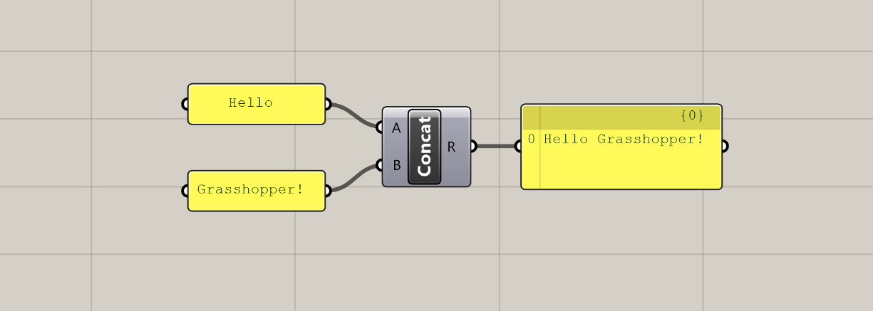
+Anatomy of a definition
All Grasshopper definitions are composed of only two kinds of elements: components which hold data and perform tasks, and wires that connect and pass data between the components. Using these two elements, we can define complex systems as assemblies of smaller parts working together to achieve a common goal.
+Components
Components are the core of Grasshopper. They define all of the individual operations that Grasshopper can do. Components are the tools in your computational toolbox 🧰.
Just like a carpenter has to first learn how all the tools in their toolbox work before they know what is appropriate for each job, a large part of learning Grasshopper is getting familiar with all of the components that Grasshopper has to offer. A component-by-component glossary is useful, but would not make for a good tutorial or an engaging online course. So we will get familiar with components the fun way: by using them to develop working definitions in the exercise sections of the guides.
For now, let's look at some of the general concepts behind components, and how they come together to form our Grasshopper definitions.
+Component types
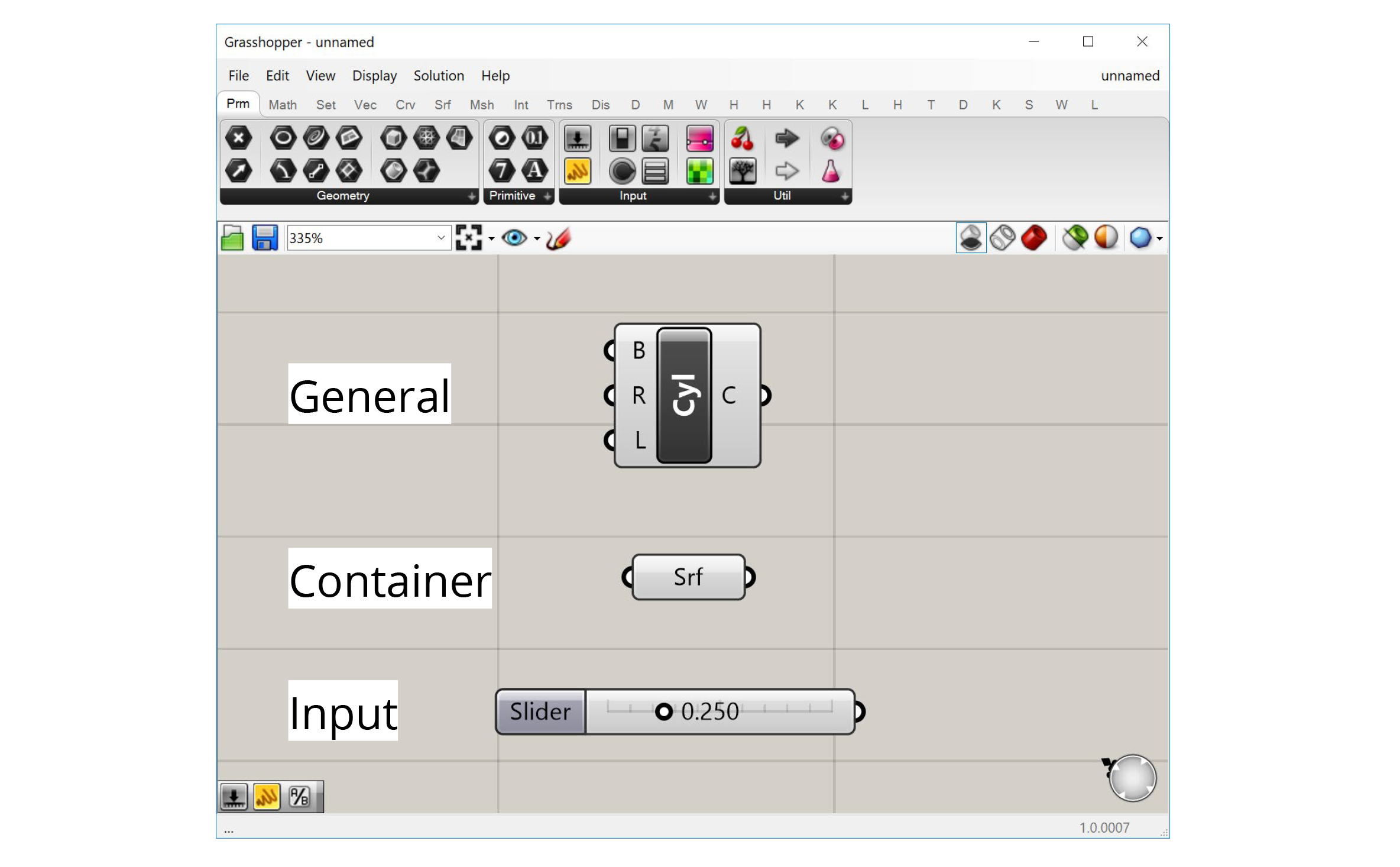
There are three types of components in Grasshopper:
- General components
- Inputs
- Containers
+General components
Most components are of the 'General' type. These components represent individual operations that do stuff in the definition. You can think of each component as a small function that takes in a set of inputs, processes them a certain way, and generates a set of outputs as a result.
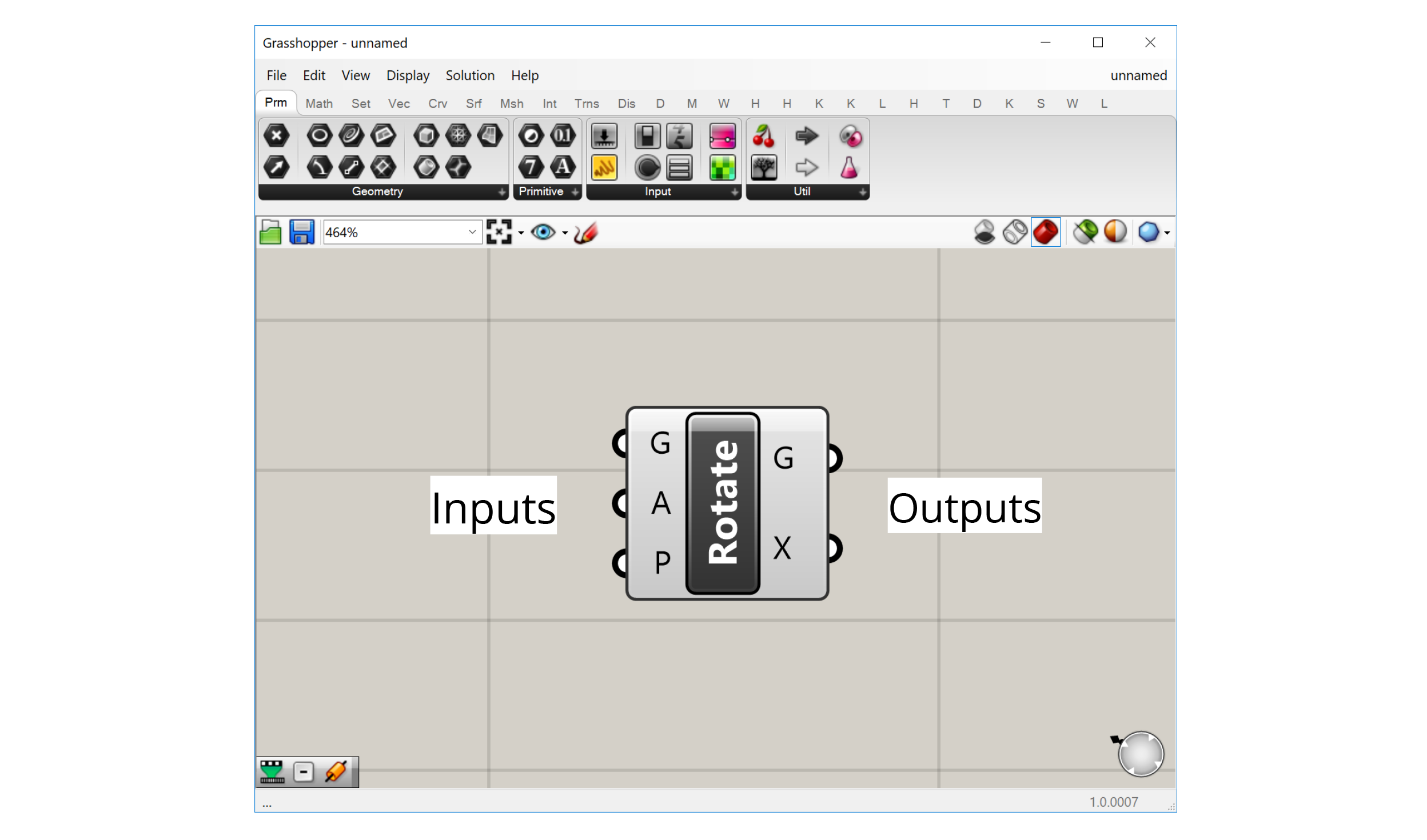
The component's inputs are represented as 'ports' on the left of the component, while the outputs are represented by 'ports' on the right. Wires can be connected to these ports to pass data from the outputs of one component to the inputs of another.
+Inputs
Inputs are a special component type that allows us to bring data into our definitions. All the input components can be found in the 'Input' group within the 'Params' tab first from the left.
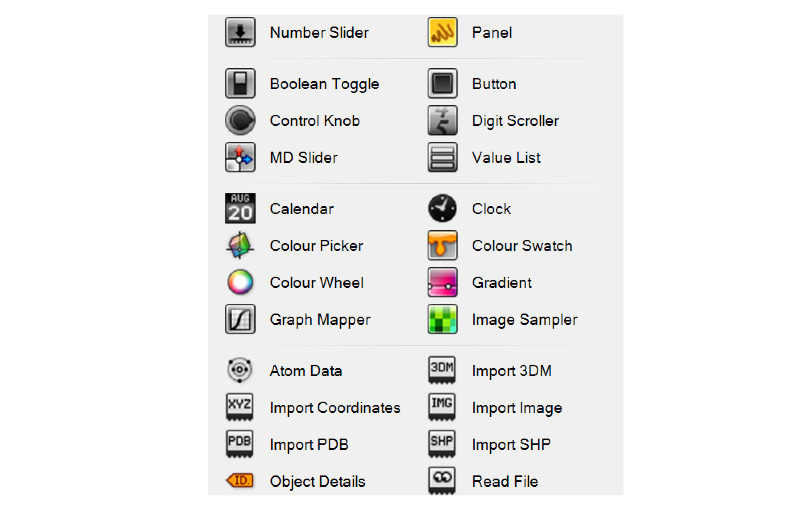
The most common input components allow us to generate data dynamically within the definition. For example, we can use a Number Slider to choose a number using a visual slider, a Panel to type numbers or text into a textbox, or a Boolean Toggle to flip a switch to set a True/False condition.
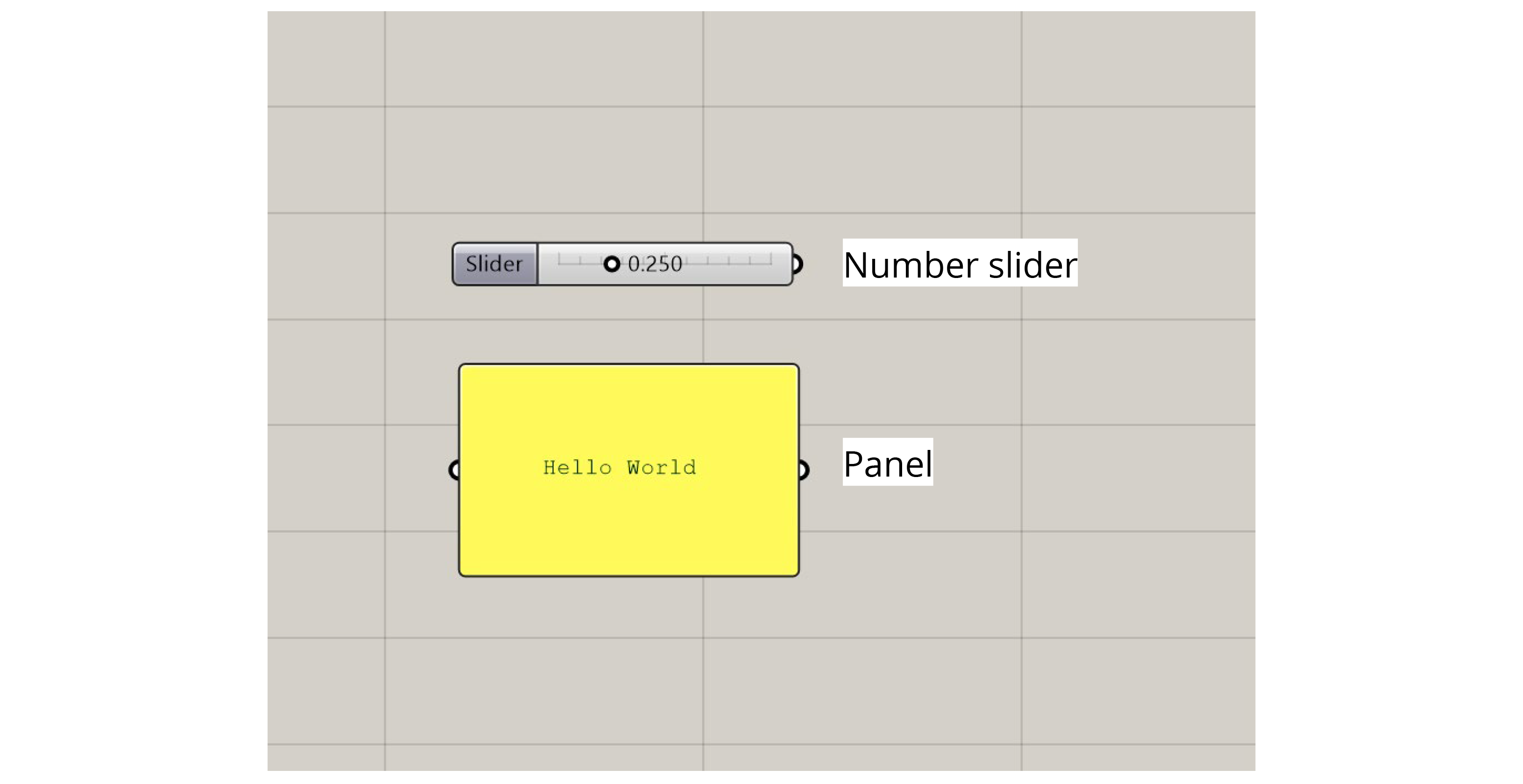
Some of the more advanced input components bring data in from outside sources. For example, an Image Sampler imports pixel information from image files, while the Import components bring data in from various other file types.
+Containers
'Container' components are another special type in Grasshopper. There are found in the 'Geometry' and 'Primitive' groups within the 'Params' tab first from the left. These are called 'containers' because they don't do anything other than store data. These components have one input port that accepts the data and one output port that passes it on.
The 'container' components are special because each one can only hold data of a specific type, and there is one 'container' component for each type of data supported by Grasshopper. The data types are split into two main categories:
Primitive data types are all the standard types like numbers, booleans, and text which are not directly related to geometric elements.
Geometric data types are all of the different kinds of geometry supported by Rhino and Grasshopper. In addition to the common types you might use in Rhino like lines, curves, surfaces, and meshes, there are also lower-level geometry types such as points, vectors, and planes. These types are usually not exposed in a visual modeling environment but are crucial when we start to define our geometries computationally.
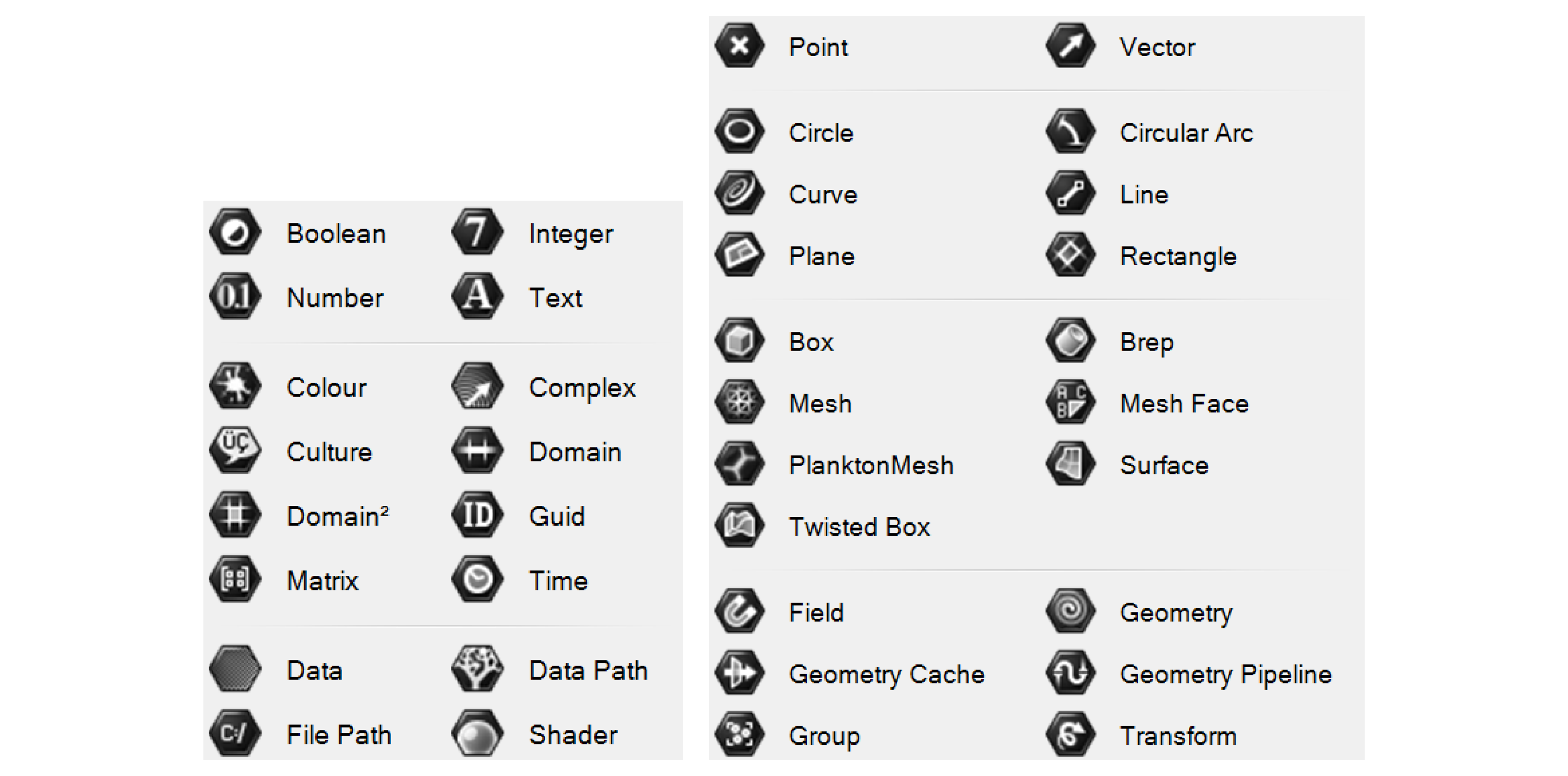
Primitive data types (left) and Geometry data types (right)
There are two ways to bring data into a 'container' component: pass the data in through the input port, or right-click on the component and use the 'Set…' options to set the data directly. With primitive data types, you can enter one or more values directly using a text box. With geometric data types, you will be sent to the Rhino window to either define the geometry directly or reference it from an object in the Rhino document. We've already seen an example of this in the last exercise where we used a Point container component to reference a base point for our model.
+Component display
Once you place a component on the canvas, you can interact with it in several ways:
+Tooltips (hover)
Hovering over the inputs, name, and outputs of a component will give you a tooltip with information about the component and the data stored inside of it. Hovering over any of the input ports will tell you the data type the input is expecting, a description of what this input is used for, and what data is currently being input. Hovering over the component's name will give you a description of what the component does (similar to what you see in the component toolbar). Hovering over any of the component's output ports will tell you the data type that the output generates, and a preview of the generated data.
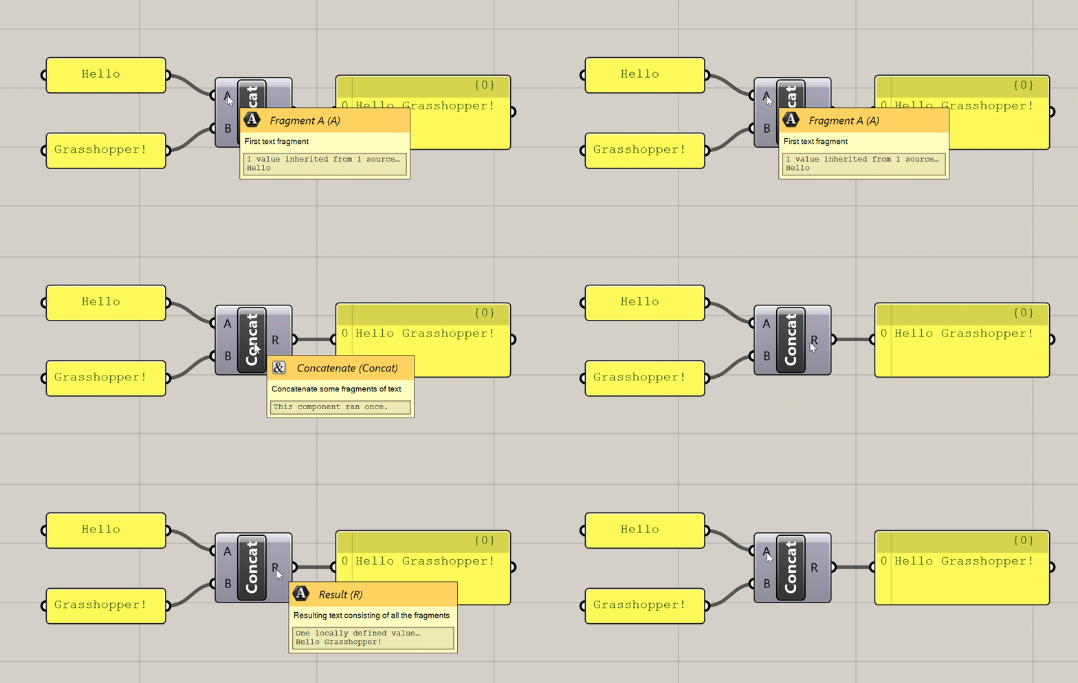
Various tooltips generated by hovering over a component
+Context menus (right-click)
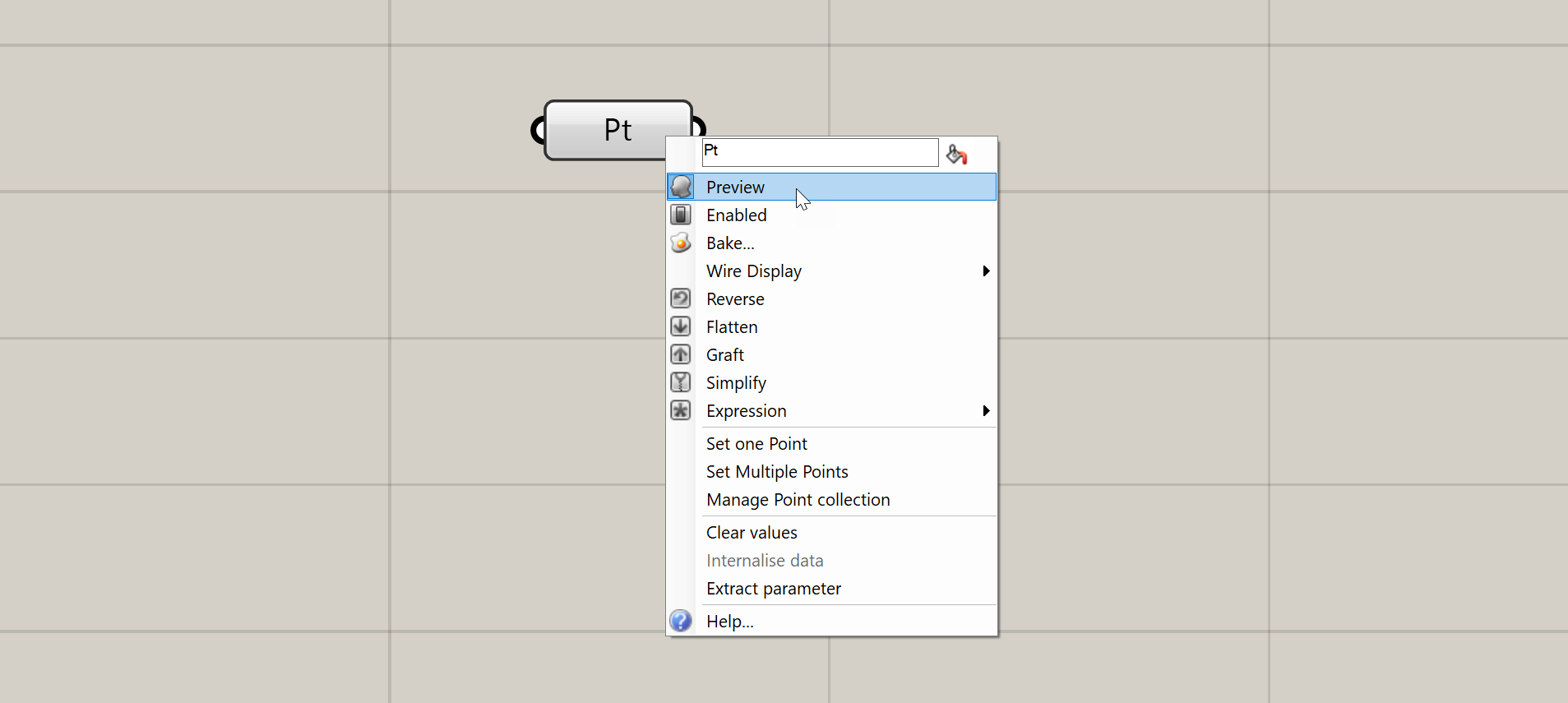
Right-clicking on the inputs, name, and outputs of any component will give you options pertaining to that input, output, or component as a whole. I will not describe all of these options here, but we will encounter them over time as we proceed through the exercises.
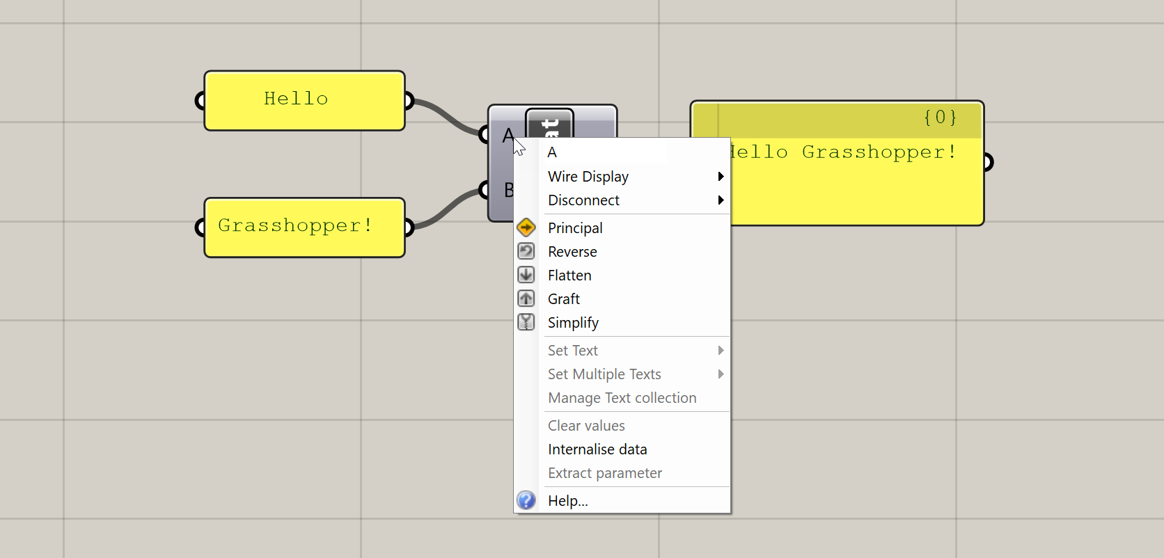
Context menu generated by right-clicking on a component's input
+Zoomable UI
This is a more recently added feature of Grasshopper which adds additional UI elements to some components based on the level of zoom in the canvas. The additional features you get with the zoomable UI depends on the type of component, but the most typical uses are adding and removing input and output ports for components that support it, and setting styling and display options within Panel components.
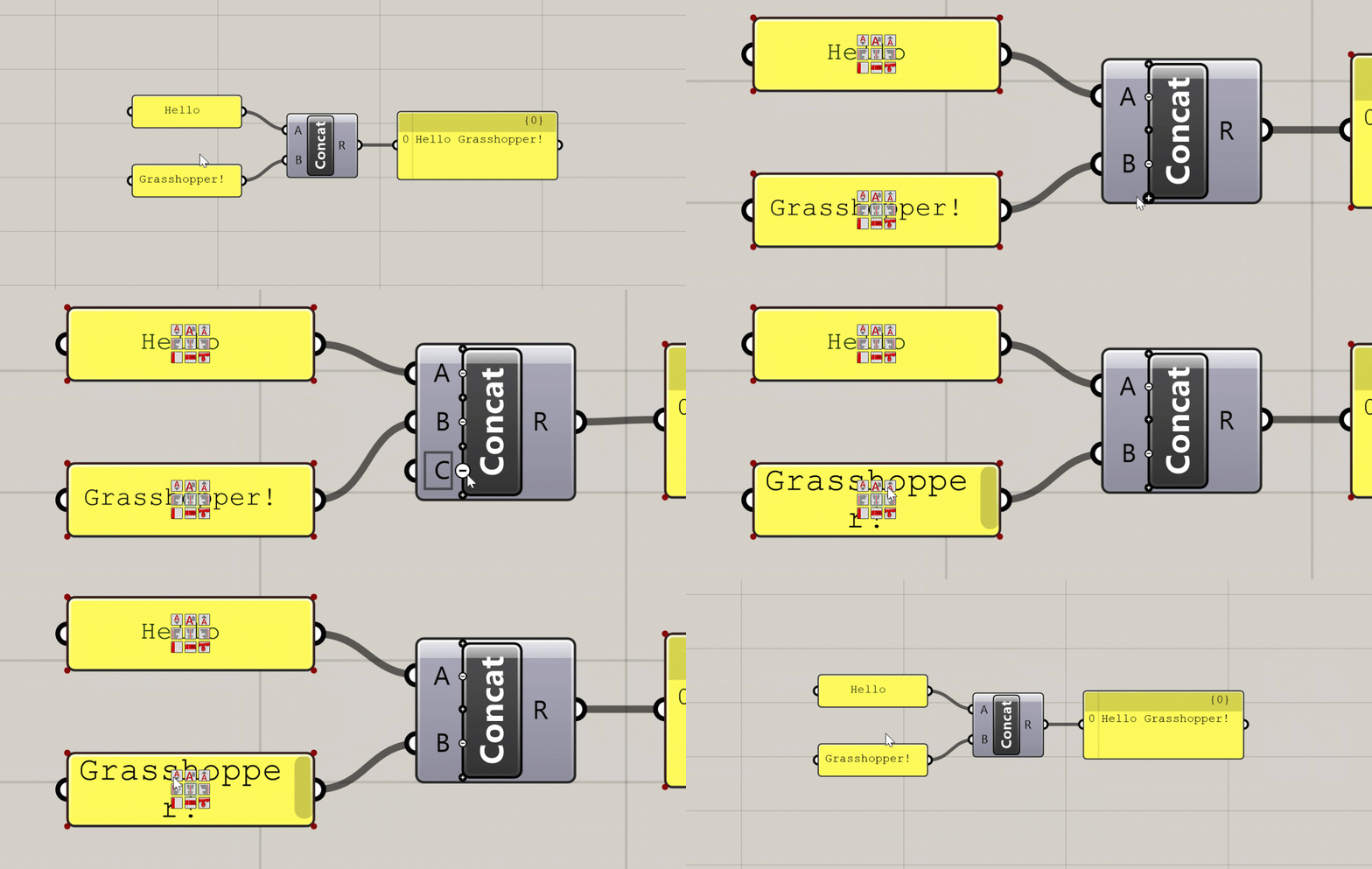
Additional UI elements generated at close zoom
+Component States
The color of the component on the canvas indicates its state. There are six possible states for a component, each with its own visual representation:
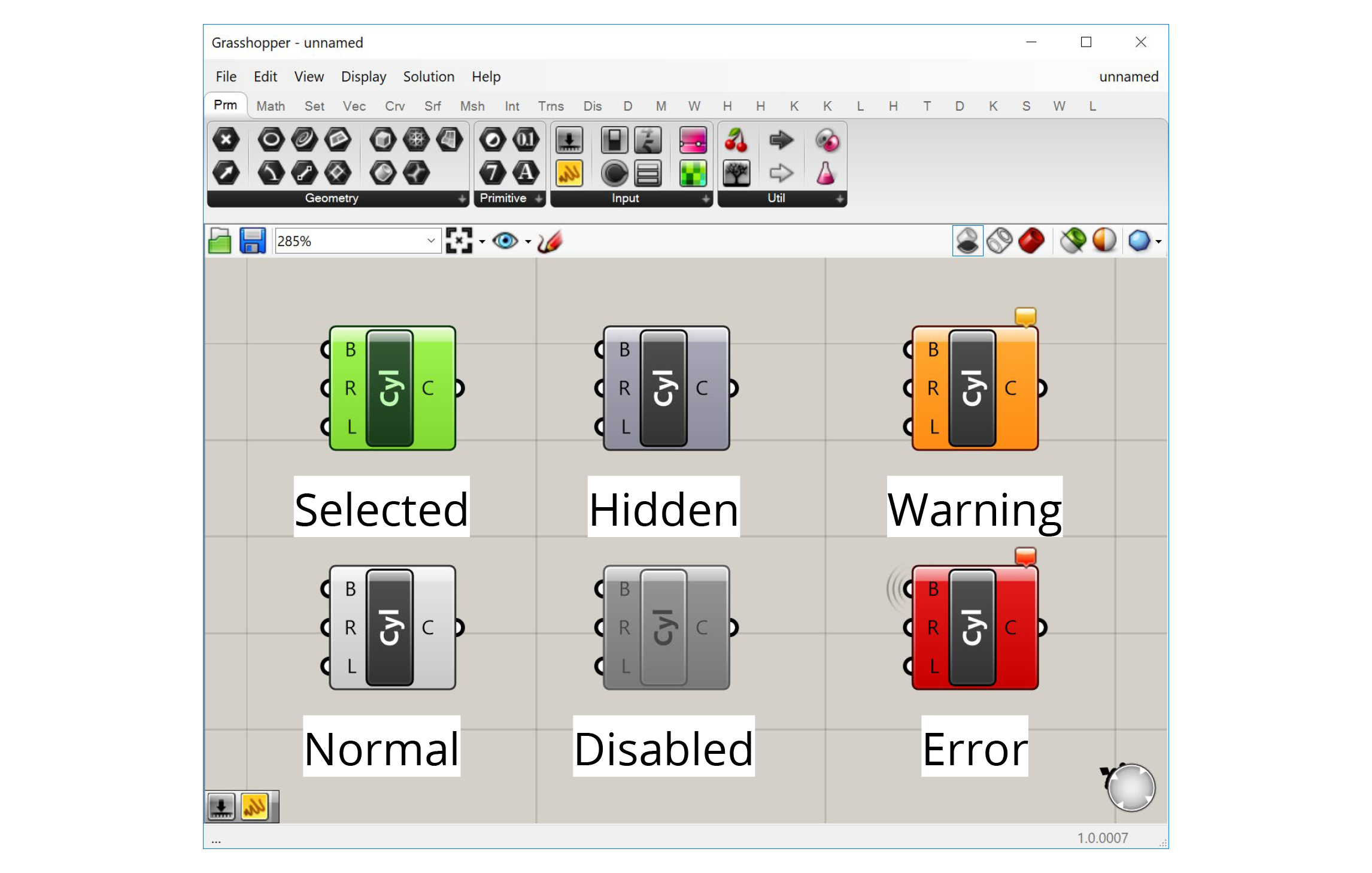
+Normal
This is the default state. The component is shown in the default white color, and any geometry generated by the component is displayed in the Rhino viewport in a semi-transparent red color.
+Selected
When you click on a component or use a selection window to select it, the component will turn green, as will the geometry generated by the component in the Rhino viewport.
+Hidden
If you don't want the geometry generated by a component to show up in the Rhino viewport, you can hide it by right-clicking on the component and de-selecting 'Preview' in the context menu. The component will turn a darker grey and its geometry will no longer be visible in Rhino. This is very useful as you start building more complex definitions to hide geometry that is needed by the definition but does not need to be seen.
+Disabled
If you want to stop a component from running you can disable it by right-clicking and de-selecting 'Enabled' from the context menu. The component will turn completely grey, and be stopped from running, which will likely stop other components which rely on its outputs from running as well. This is useful for turning off entire sections of your definition, for example when trying to isolate a problem or temporarily disabling a part of the definition that takes a long time to compute.
+Warning
If there is a non-critical issue with the component that does not completely prevent it from running, the component will produce a warning and turn orange. This usually happens if you have not supplied any data to an input that requires it, or something went wrong with a particular input that did not prevent the rest of the inputs from being processed. You can see the warning by hovering over or left-clicking the bubble in the component's upper right corner.
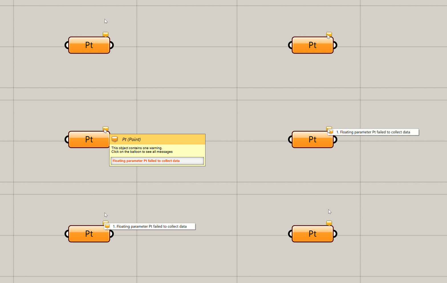
You can see a warning or error message by hovering over or clicking on the bubble
+Error
An error is similar to a warning, but an error is more critical, usually meaning that the component failed completely and did not generate any outputs. If a component has an error it will turn red. As with a warning, you will see a small bubble on the component which will give you more information about the error.
+Connecting components with wires
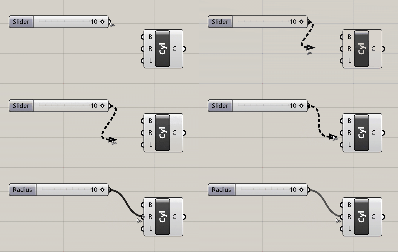
To pass data from one component to another you connect their ports using wires. To create a wire, click on either an input or output port, and while holding down the mouse button drag your mouse over a port of another component you want to connect it to. When you hover over a valid port, the wire will snap into place and turn solid, meaning you can make the connection. Release the mouse button to create the wire, which will now be shown on the canvas.
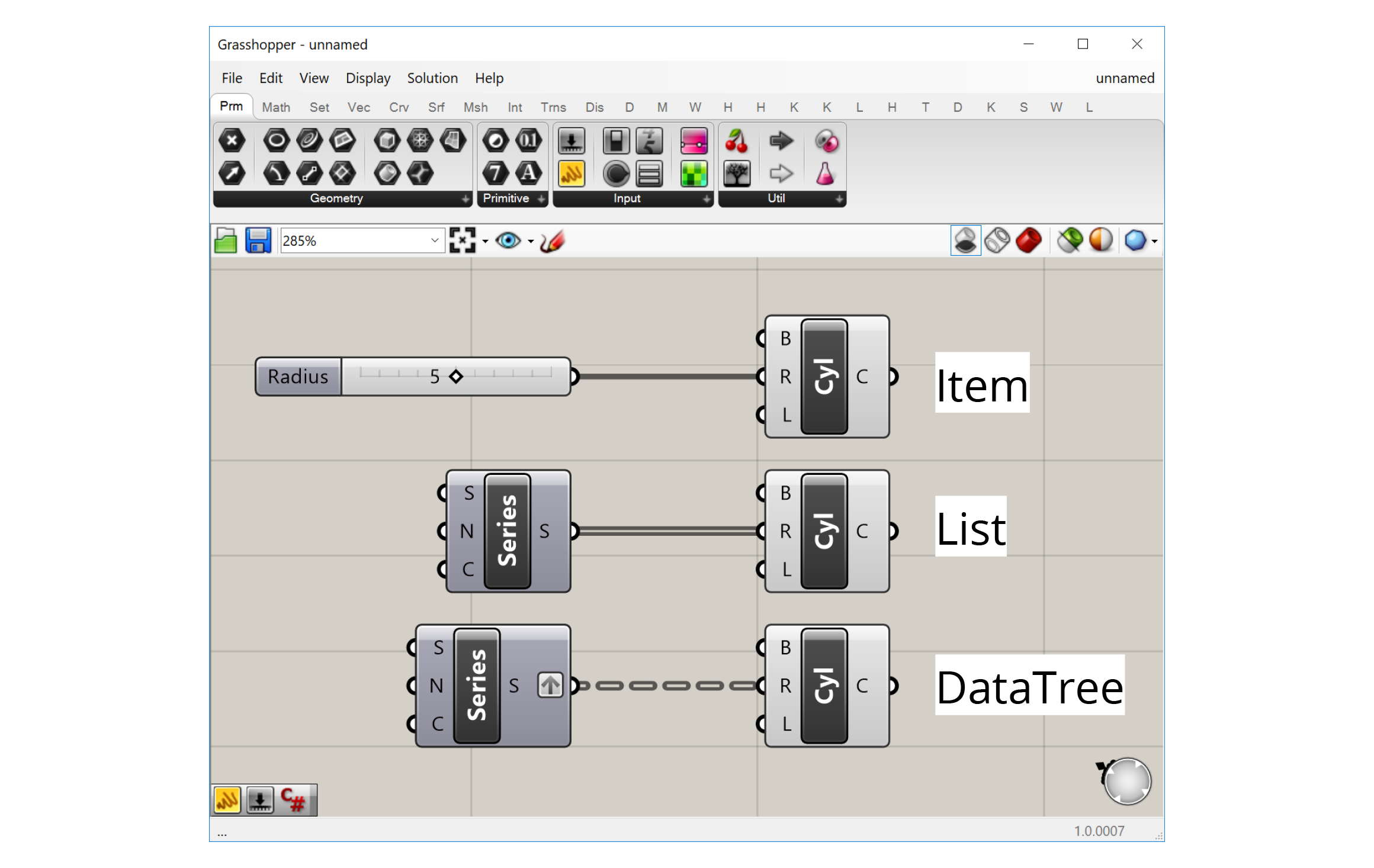
The visual representation of the wire depends on the nature of the data flowing through it. With a single item of data, for example one number, the wire will be a single line. If it is carrying several items of data in a List, the wire will be a double line. If it is carrying data in a more complex structure known as a DataTree, the wire will be dashed. We will cover Lists and DataTrees in more detail in a later guide.
+Making the data flow
When you connect the output of one component to an input of another, you are carrying the data produced by the first component to the second component which will use it to create its own outputs. These connections create dependencies between the components, as the second component won't be able to do what it needs to do unless it receives the proper data from the component 'upstream'. This creates a 'flow' of data through the definition—starting from the initial inputs on the left and ending with the final results on the right.
Unlike other types of computer programs, Grasshopper definitions are 'steady-state' programs, meaning that the definition only calculates when something has been changed, but otherwise is inactive. While a definition is being calculated the interface is frozen, and only after a definition has been fully processed will you be able to navigate the Grasshopper and Rhino windows and see a preview of the generated geometry.
Because of its steady-state nature, Grasshopper does not allow connections that form 'loops' in the definition, which happen when an output of one component is passed as an input to another component on which the original component depends. Although loops are a common tool in traditional text-based programming, in Grasshopper loops would create an infinite perpetual cycle which would cause it to freeze permanently, so they are not allowed by default. There are, however, external libraries that allows these kinds of loops through special components.
The steady-state nature of Grasshopper also means that components only run when they need to, which is any time the data they depend on is changed. When you change a component 'up-stream', any component that depends on it 'down-stream' will be recalculated, while any components that doesn't depend on it will remain unchanged. Although in the beginning this may seem like a technical detail, as your definitions become more complex it is important to consider these dependencies to make sure your definition is working as efficiently as possible.
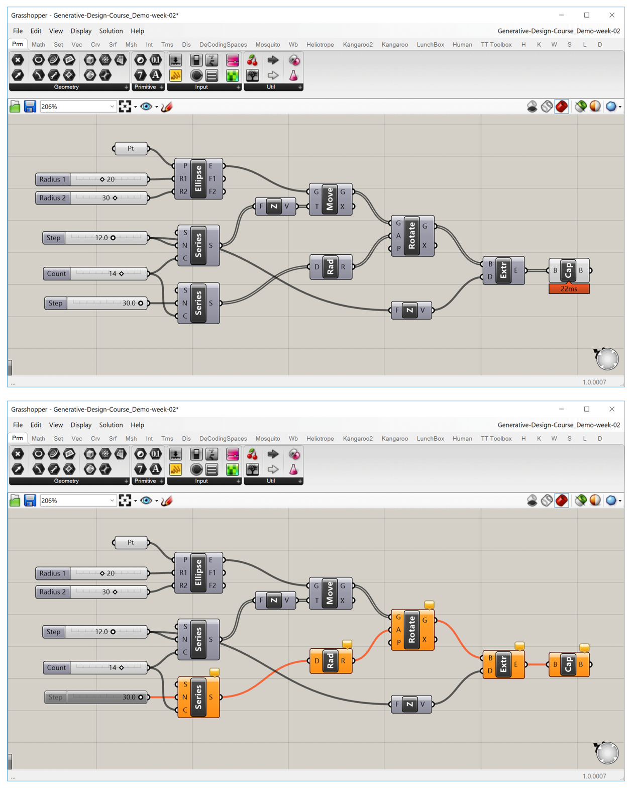
When we turn off one slider, any component that depends on it will be affected, while other components will remain unchanged.
+Navigating the canvas
Most of Grasshopper's interface is focused on the canvas, which is where you compose your definitions by laying out the components and connecting them with wires. Working in the canvas should be pretty intuitive for anyone used to working with digital design tools, but let's spend some time looking at a few of its more advanced features which will speed up your workflow and allow you to get the most out of Grasshopper.
+Context menus
Clicking on an empty part of the canvas will bring up a set of context menus that will help you select components and access common options faster.
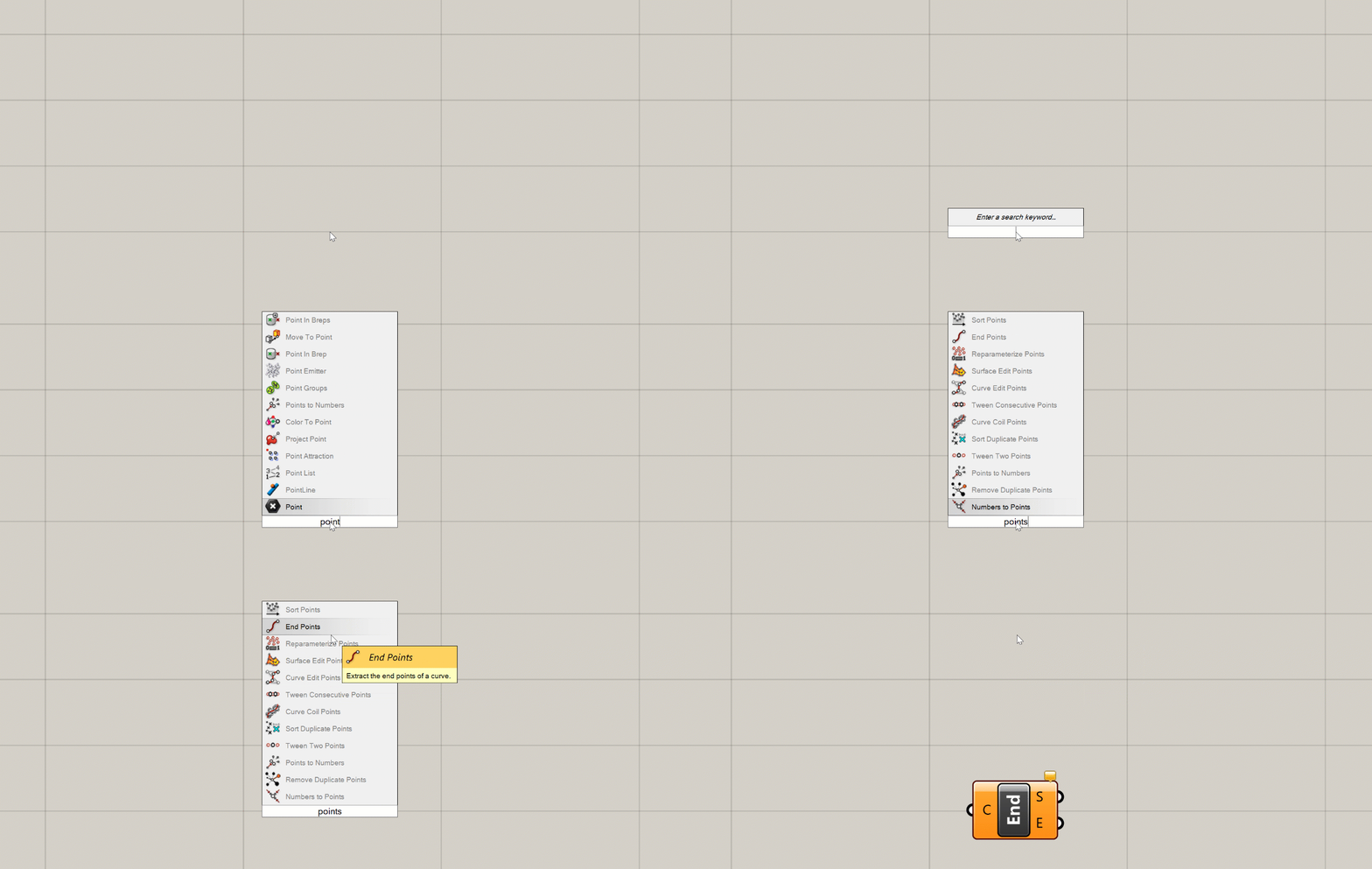
- Double-clicking on the canvas with the left mouse button brings up the component search bar. Once the search bar pops up you can start typing the name of the component you want to create and the search bar will present the closest matches from the components you have available. You can then press Enter to select the closest match, scroll through the matches with the arrow keys, or select from the matches with the mouse to place the chosen component on the canvas. As long as you know the name of the component you want to create, the search bar can be a very quick way to find it.
- Clicking on the canvas with either the middle or right mouse button brings up a context menu that allows you to select from a set of common options. For example, if you have a set of components selected you can control their visibility or turn them on and off all at once. You can also use the context menu to group components and create Clusters, as well as control the execution of the definition itself. For example, you can lock the definition to keep it from running or force it to recalculate. The middle and right mouse button menus contain the same exact options but organized a different way, so you can use whichever one you think is more convenient.
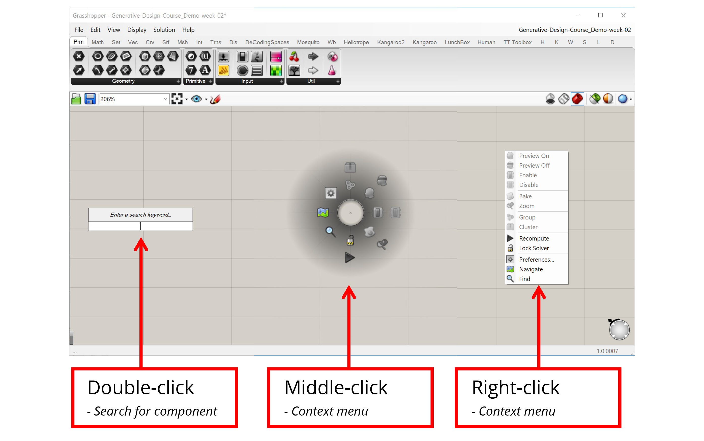
+Grouping and Clustering
Groups and Clusters allow you to work with sets of components. To create a Group or Cluster, you must first select a set of components, which you can do by either holding down Shift and clicking on them one by one or by using the left mouse button to click and drag a window around the components you want to select. Once the components are selected, you can use the context menu to create a Group or Cluster.
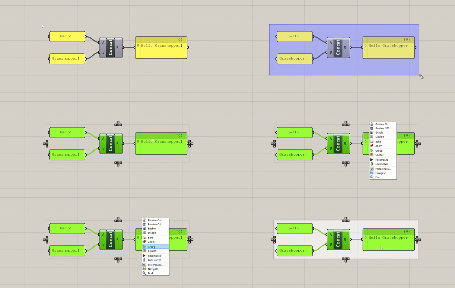
When you create a Group, Grasshopper will place a new Group object around the selected components. You can then select this object to move all the components in the Group at once. You can also right-click on the Group to select all the components inside as well as add and remove components from the Group. You can use the shortcut Ctrl+G to create a Group as well.
When you create a Cluster, Grasshopper takes all the selected components and places them inside of a new component. Any wires leading to the components become the inputs of the new Cluster component, and any wires leading out become the outputs. You can think of this as creating your own custom components out of a set of other components. To edit the components in the Cluster you double-click the Cluster component, which brings up a separate canvas showing the components inside. Once you're done editing you can save your changes and go back to the main definition canvas.
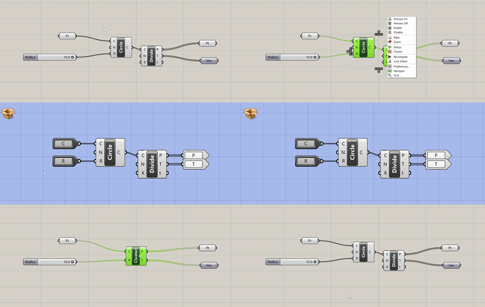
Clusters are especially useful when you have a set of components doing a specific task that you reuse often. Once you define a Cluster, you can copy and paste it within your definition or into other definitions. Copies of Clusters act as instances, meaning that when you edit a Cluster and save changes, the changes are updated in every instance of that Cluster. With Clusters, you can start to define your own library of specialized components without knowing any code.
+Widgets
Widgets are extra UI elements that appear on the canvas in certain instances. You can see what widgets are available and turn them on and off in the main menu under 'Display → Canvas Widgets'.
- The Align widget appears when you select two or more components. This widget helps you lay out the components more evenly on the canvas and can be a great tool for keeping your definitions visually organized.
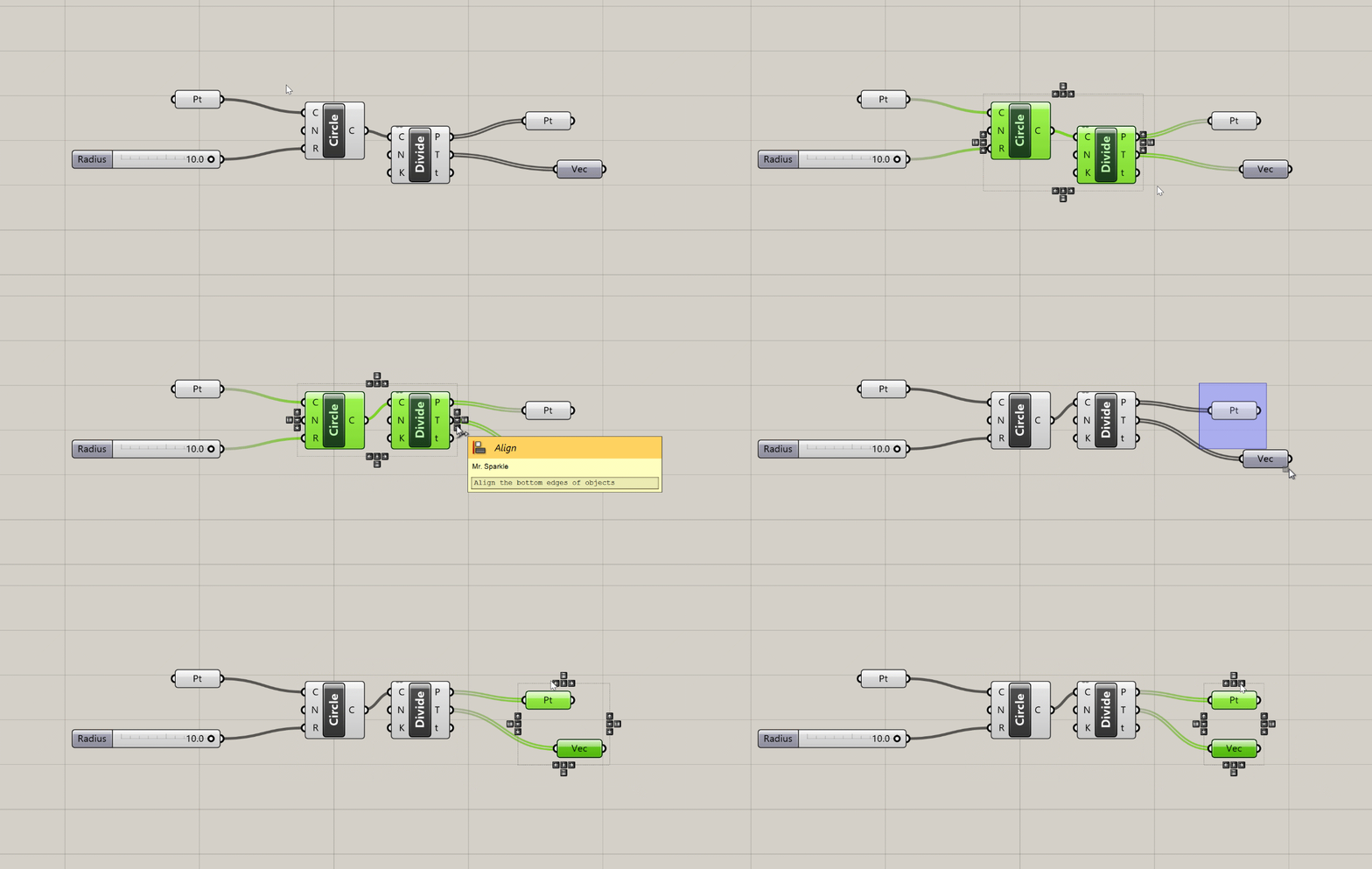
- The Profiler widget is turned off by default, but if you turn it on you will see a balloon under some components that will tell you how long the component took to execute. This can be very useful for troubleshooting and optimizing more complex definitions. Like most UI elements in Grasshopper, the Profiler balloons appear only at certain zoom levels, and only for components that take more than a few milliseconds to calculate.
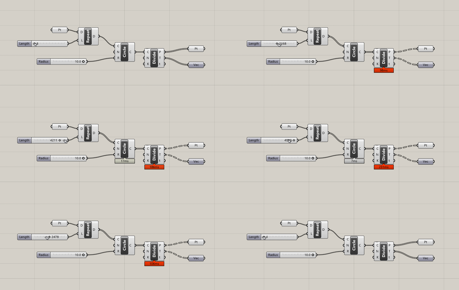
Profiler balloons appear below components that take longer to execute as the amount of data passing through them increases.
+Canvas Toolbar
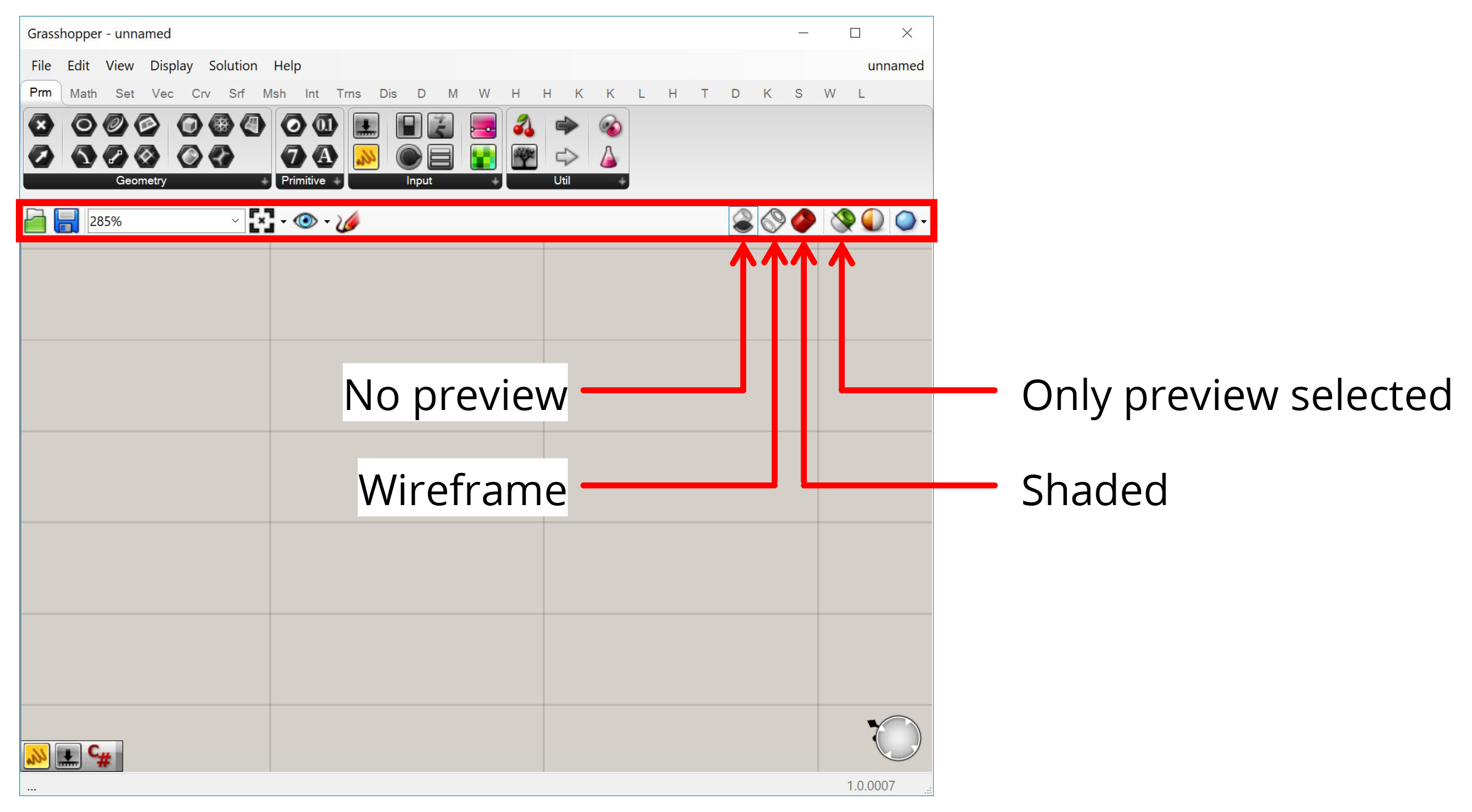
Between the component toolbar and the canvas there is a toolbar with options for the canvas. The most important things here are the buttons on the right which control how your Grasshopper geometry is previewed in Rhino. The first three buttons give you global control to preview all geometry in Shaded or Wireframe mode or turn it off completely. The fourth button makes it so that only geometry contained within selected components is visible. This is useful for figuring out what each component is producing when troubleshooting a definition or learning how it works.
+Exercise: Parametric tower
In this guide, we looked at the two basic elements common to all Grasshopper definitions: components which define a set of operations, and wires that connect the components together. Using these two elements, we can start to represent complex design systems by first breaking them down into a set of smaller interrelated parts, and then building out the relationships between them in the Grasshopper canvas.
In the following exercise, we will get more hands on experience in Grasshopper by constructing one of the most classic examples of computational design—a parametric twisting tower!

+Step 1: Design concept and strategy
As with any design process, when approaching a new computational design problem it is useful to spend some time thinking through the problem you are trying to solve and formulating a concept and approach to guide your design process. Most Grasshopper tutorials only focus on the what of computational design, with step-by-step instructions describing the process of building a particular model. This can teach you some useful tools and approaches but misses the critical points of how to think about design problems computationally, and why we might want to do this in the first place.
When formulating a concept for your model, a good approach is to first sketch what you want to achieve and then 'reverse engineer' it to figure out how to build it. In this case, I want to create a twisting tower with parameters to control the amount of twist as well as the height of the tower and the shape of the floors. I can start by sketching out what I think a twisting tower might look like. Don't spend too long on these sketches, they don't need to be especially detailed or of high artistic quality. Nonetheless, they are important for getting a rough understanding of what you want to build so that you have a good strategy for how to start in Grasshopper.

Once I have a basic design approach in mind, I can start to break it down into components to develop a strategy for building the model. Looking at the sketches I can observe that the twisting effect comes from having similar shape floors that rotate relative to each other as they go up the building.
Based on this observation, I can develop a strategy for building the model in Grasshopper. For example, I might first figure out how to create one floor, then copy the floor multiple times vertically, adding a small rotation to every copy. Of course, you will need to adjust your strategy while you build the model based on what you find works and doesn't work, but starting with an initial visual concept and strategy will make the process of starting a model much easier.
+Step 2: Define the base point
As we saw in the previous exercise, a good place to start a model is with a base point that defines a point in space relative to which we can start defining the rest of our geometry.

Last time we used a Point component to define the point in the Rhino viewport. This time, let's use a Construct Point component to build the point directly in Grasshopper. This component has three numerical inputs representing the X, Y, and Z coordinates of the point in 3-d space. Each of these inputs has a default value of 0, which means that when you first place the component on the canvas it will create a point at (0,0,0) or the model's origin. If you want to move the point somewhere else you can input a Number Slider or Panel with a numerical value into any of the inputs. For now, let's keep the defaults to leave our base point at the origin.

+Step 3: Model the first floor
Once we have a base point to locate our tower, we need to define the shape of the first floor. Based on the sketch, I want something curvy and not rotationally symmetric so I get the twisting effect when I rotate the floors relative to each other. I will choose to model my floors with an ellipse but feel free to experiment with other shapes as well.

To create the ellipse we can use the Ellipse component, which creates an ellipse based on a center point and two numbers that define its radii in both directions. Let's connect the base point we just created to the (P) input and connect two new Number Slider components to the two radius inputs.

Here is a useful shortcut for creating Number Slider components: double-click anywhere on the canvas to bring up the search menu and type any number in the search bar. This will create a Number Slider component set to that number. The decimal places you use in the number controls the decimal resolution of the slider. By default, the range of the slider will go from 0 to the closest power of 10 to the number. You can also set the range yourself by typing the minimum and maximum values, along with the number, in the format min<number<max. For example, typing in 0<25<50 will produce a number slider with the range 0-50, set to 25.

+Step 4: Create more floors
Now that we've built one floor, we can multiply it vertically to create the other floors. In Rhino we would do this with the Copy or Array command. In Grasshopper, things work a little differently. Each component on the Grasshopper canvas runs individually, and stores the data it produces in its outputs. Even if that data is then passed on to one or more components downstream, the original data produced by a component will always remain within that component. This means that objects created by one component cannot be directly modified by another component, but only used for generating its own outputs.

The persistence of data in the canvas means that Grasshopper does not need separate components for copying or arraying objects. Instead, you can use the Move component to translate the object one or more times, and then hide the original object if you don't want to see it in the Rhino viewport.
The Move component has two inputs: the geometry (G) you want to move and a translation vector (T) that describes the magnitude and direction of the move. Create a new Move component and place it to the right of the Ellipse component on the canvas. To specify the geometry, connect the ellipse created in the (E) output of the Ellipse component to the Move component's (G) input.

To specify the direction of the move, we will use a Unit Z component to create a new vector pointing in the model's vertical Z direction. If you look in the 'Vector' section of the Vector tab of the component toolbar you will see that there is one Unit Vector component for each of the three coordinate axes. Place a new Unit Z component on the canvas and connect its (V) output to the (T) input of the Move component.
You should now see a copy of the ellipse appear one unit length above the original ellipse. The Unit Vector components have one input (F) which controls the magnitude of the vector. This input has a default value of 1.0, so by default these components create vectors of one unit magnitude (such vectors are called unit vectors).

Since the magnitude of the vector will control how much the ellipse is moved, it should be based on the height of each floor. But we don't want to only create one floor. We want the Move component to run multiple times, creating a new ellipse each time and moving it vertically to its proper location. To do this we will first create a list of values representing the height of each floor, and then pass this List to the Unit Z component to create a set of vectors to move all the ellipses into place.

A quick way to generate a set of evenly spaced numbers is with the Series component. This component creates a set of sequential numbers based on three inputs: the starting value (S), the step or increment between each value (N), and the number of values to generate (C).
We will keep the default starting value of 0.0 so our first floor stays in the same place as the original curve. Let's create two new Number Slider components to control the other two inputs. The step size controls the distance between each height value, so the first Number Slider component will set the floor-to-floor height of the building. The number of values we want to generate is based on the number of floors we want to create, so the second Number Slider component will control the total number of floors in the building. You can rename the Number Slider components so you remember what they control by right-clicking on them and changing the name at the top of the context menu.

Connect the (S) output of the Series component to the (F) input of the Unit Z component to generate the floors of the tower. We now have a simple tower definition based on four parameters. You can slide the Number Slider components one by one to get a feel for how they control the model in real-time.
+Step 5: Let's twist
To create the twist in our tower, we will apply a rotation to each of the ellipses. First, let's use another Series component to generate a list of numbers representing the rotation angles of each floor. Since we need one rotation value for each floor, we should reuse the same Number Slider component that specified the number of floors previously for the (C) inputs of both Series components in our model. This way, if we want to change the number of floors in the future, all we have to do is change one Number Slider component and everything will update correctly. Reusing input data within your model is good practice for making robust models and minimizing the chance of bugs later on.

Once the rotation values are generated, we can use them to rotate our ellipses using the Rotate component. Create a new Rotate component on the canvas and connect the ellipses to its (G) input and the angle values to its (A) input. In Grasshopper, angles are usually expected to be in radians. If you'd prefer to work in degrees, you can pass the values through the Radian component first to convert the degrees to radians, and then pass the resulting radian values to the Rotate component.

Because the original non-rotated ellipses are still stored in the Move component, you will probably see the new rotated Ellipses overlapping them in the Rhino viewport. At this point, it may be useful to start hiding the outputs of some of the earlier components to create a cleaner visualization of the final result.
+Step 6: Give it (solid) form
The last step of this exercise is to create the solid volumes of the building by extruding each ellipse vertically based on the building's floor-to-floor height.

To extrude the ellipses we can use the Extrude component. This component has two inputs: one for the Curve you want to extrude, and one for the Vector that describes the magnitude and direction of the extrusion. Create a new Extrude component and connect its (B) input to the (G) output of the Rotate component which is storing the rotated ellipses.
To define the direction of extrusion for each curve, let's use another Unit Z component. Connect its (F) input to the Number Slider component we created previously to control the floor-to-floor height and it's output to the (D) input of the Extrude component. Since we are connecting multiple curves but only one vector, the same vector will be reused for each extrusion, which is fine since all the floors of the building have the same height.

At this point, you should see a stack of ribbons defining the shape of the tower. The last step is to create the lower and upper surface of each volume by passing the result of the Extrude component into a Cap component. This component will fill in any planar holes in a Surface or Polysurface object. Once the top and bottom holes are capped, we will have one closed Brep or Polysurface object defining the volume of each floor in the tower.

This concludes our basic twisting tower definition. In case you got lost along the way, you can download a finished version of the demo here:
+CHALLENGE 2: Square floors
We built our simple parametric tower definition based on elliptical floors. What if we wanted rectangular floors instead? The beauty of Grasshopper is that once you define your model's logic once, it should be relatively easy to make changes by replacing certain aspects of the model while keeping the rest of the logic intact.
Try replacing the Ellipse component with one or more other components to change the shape of the floors while keeping the rest of the tower definition the same. What kind of interesting towers can you create by combining the twist operation with floors of different shapes?
+Conclusion
In this exercise, we defined the basic twisting form of a parametric tower. The five Number Slider components we created while building the model can now be used to control the various parameters of the tower. Spend some time experimenting with the parameters and see what kind of different tower shapes you can create.
